如何绘制柱状图图表
案例
案例一
源码
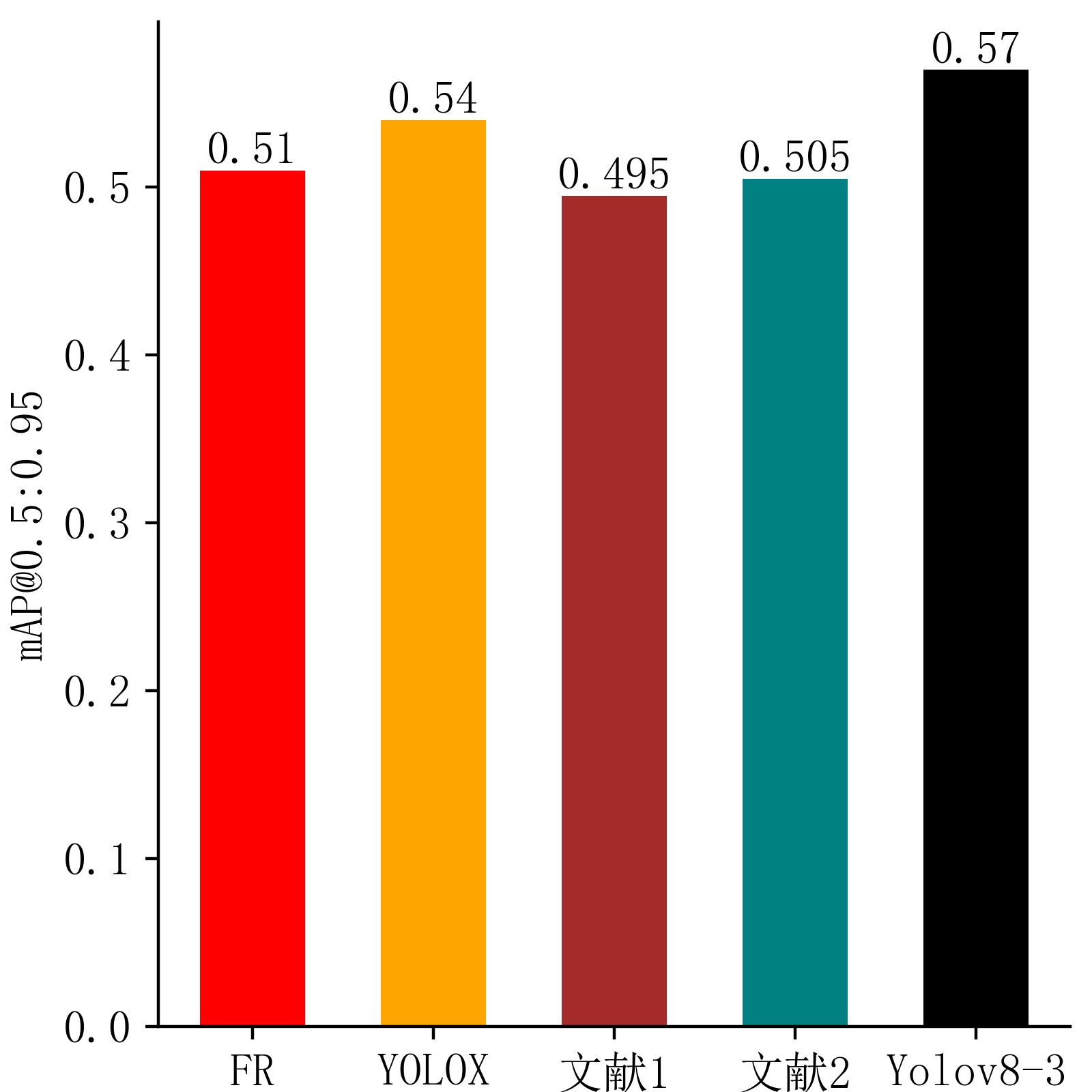
1 | # [email protected]柱状图 |
输出结果
案例二
源码
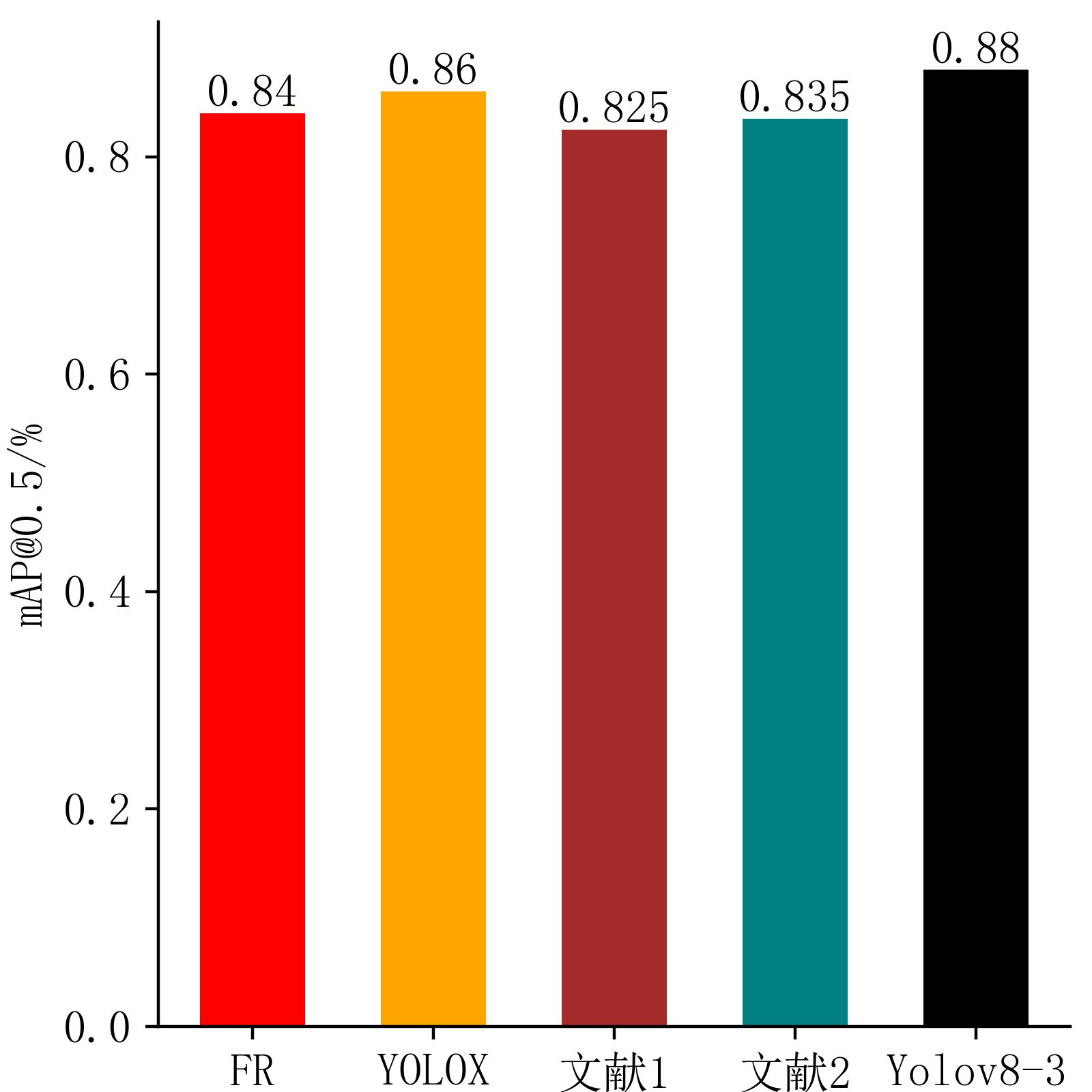
1 | # [email protected]柱状图 |
输出结果
案例三
源码
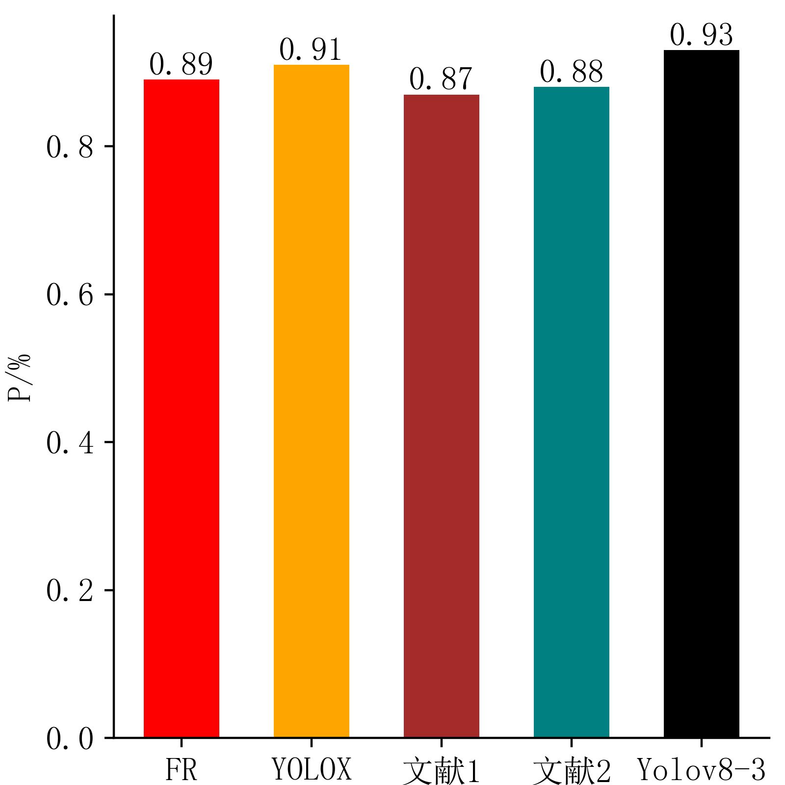
1 | # P柱状图 |
输出结果
案例四
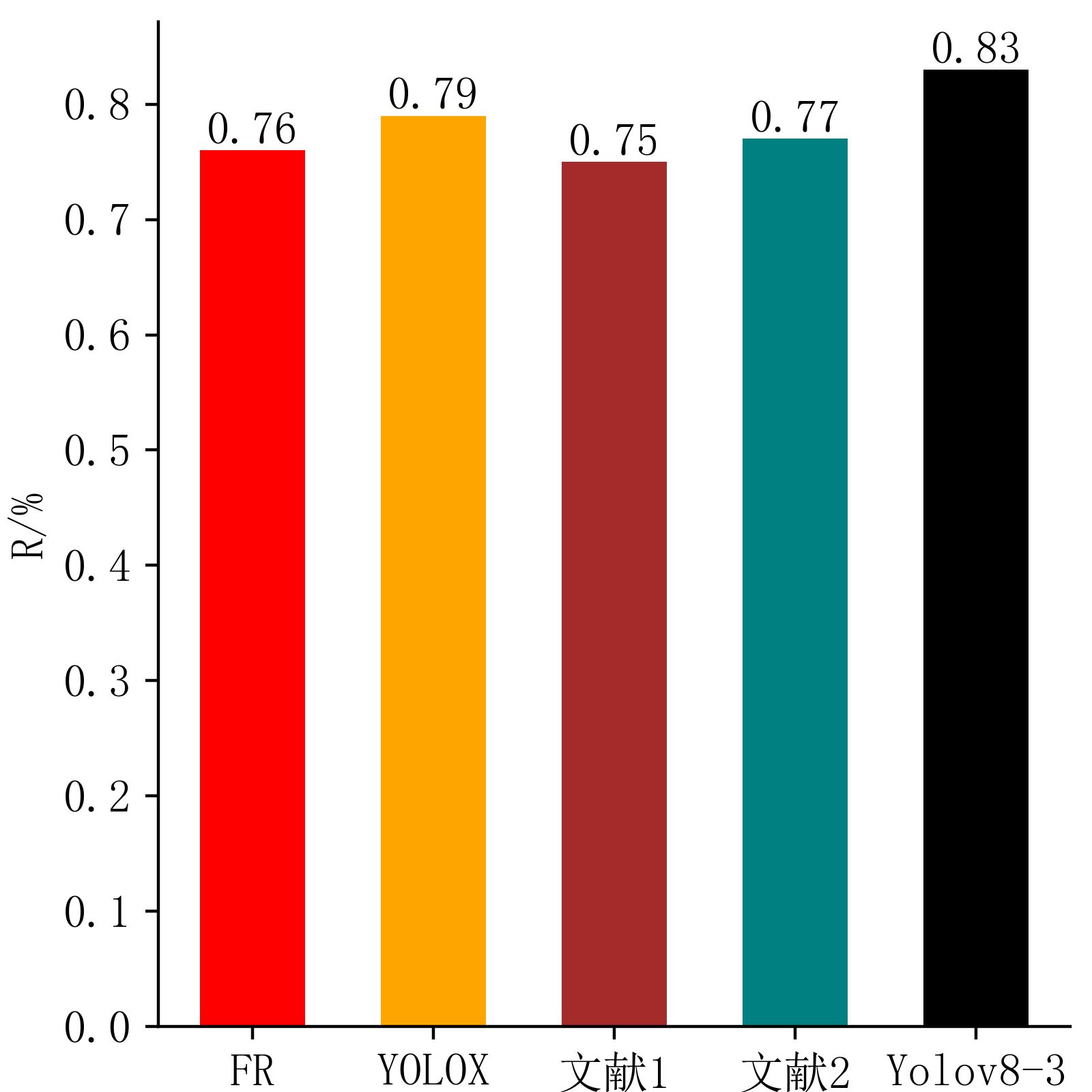
1 | import matplotlib.pyplot as plt |
输出结果
除特別声明外,本博客所有文章均遵守 WTFPL 许可。
相关推荐

2025-04-20
GitHub最佳实践之发起你的第一个PR
你可以把 Git 比作是一本笔记本,而 GitHub 就像是一个云笔记平台(比如Evernote),它让你可以随时随地访问、分享和协作管理你的笔记(代码)。
2025-01-01
”Hello world!“
基于hexo框架的个人博客,以及其上二次开发的butterfly主题
2025-04-04
TRY-写一份实习报告发言稿
思维在指尖流动,所以诞生了文字,文字本没有想法,却被人赋予了灵魂。
2025-03-10
baka也想玩爬虫之怒爬实验手册
豪丸,爬虫真的是需要推理和思考的东西
2025-06-19
从汇编入手C语言
结合汇编3小时彻底理解C语言本质,讲解C语言函数,语句,结构体,指针,数组,浮点数的汇编实现
2025-03-03
琪露诺的FastAPI教室day01
baka也想做后端!
评论